The Evolution of the Havana Club logo
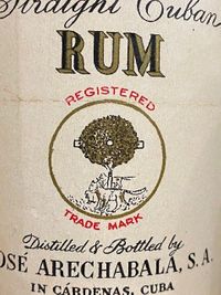
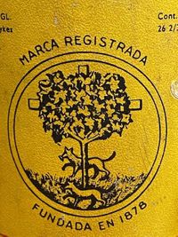
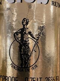
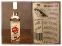
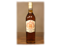
In 1878 José Arechabala founded his distillery in Cardenas. He named it La Vizcaya (the Bizcay), after his native region in Spain. On the logo you can see the coat of arms of this region. It includes also an oak tree and wolves that represented the Lopez de Haro family which were lords of Bizcay. One of the wolf carries a sheep in his mouth. A reference to the Navas de tolosa battle in 1212, in picture 2. There you can also see the combination between the coat of arms of Bizcay and Bilbao. On top of the Bilbao bridge is a tower with a giraldillo which could be the inspiration of La Giraldilla we know from today.
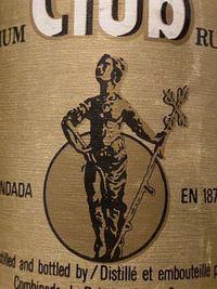
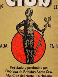
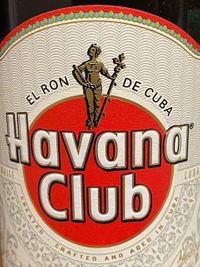
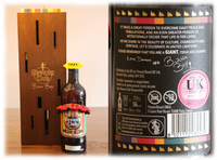
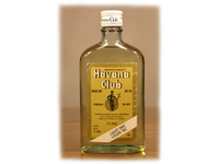
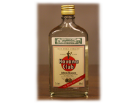
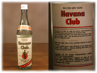
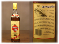
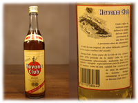
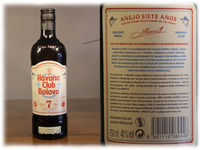
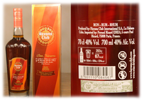
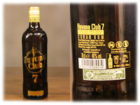
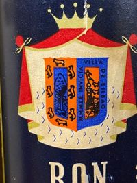
As you know the first Havana Club was launched in 1934 with this kind of different features on it label. After the first two series of Havana Club they changed the logo in the early 50s (pict. 3). There you will miss the coat of arms, but still find the oak tree and the wolves. After the revolution in 1959 Havana Club was owned by the government. In the mid. 60s they changed the logo where you can see La Giradilla in front of the sun (pict. 4). During the next years the logo became more colorful but didn’t change a lot (pict. 5&6). It was the main logo till 1995. Havana Club started a new marketing era after they completed a joint venture with Pernod Ricard in 1993. Since that time La Giradilla became her (smaller) place on top of the red sun and „Havana Club“ is printed on the sun (pict. 7).